8 tips to designing desktop navigation bars
8 tips to designing desktop navigation bars
👉 To kick off, navigation is a HUGE topic and the micro book and series will cover everything but with 3 posts I wanted to dive straight in to the practicals of designing. Navigation is all about hierarchy with lateral, forward and reverse navigation. This post focuses on designing a top navigation bar.
💪 Size is important across every component and I recommend using a max width with your navigation bar. Padding wise stick to the 8px rule of 16px and 24px.
👨 Typically left till last but I like to focus on the personal side of a product early. Get the avatar right with a handy dropdown to all personal pages like account, billing etc.
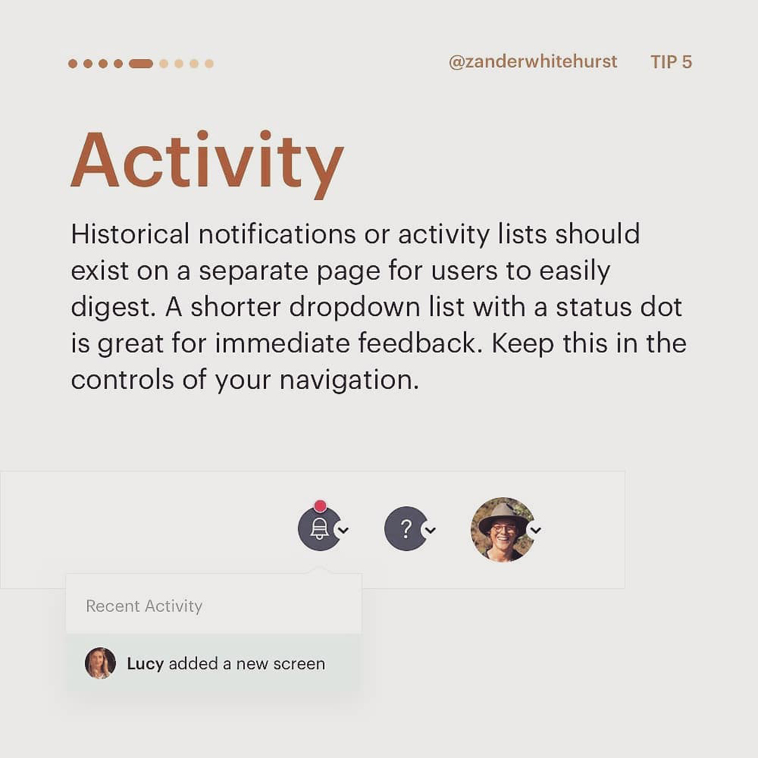
👆 It’s good to break your navigation between controls and primary tabs. Controls include support, activity and forwards navigation of search.
👈 Swinging left is your product icon / name as reference with 2-5 pages.
👍 I hope this helps you kickstart any navigation designs for desktop. We will be covering mobile and responsive navigation over the week but this one is a fun one to kick it off! 🙌🙌 ..


