


8 tips for designing dark themes
8 tips for designing dark themes
-
Author: @tomkoszyk
-
When done well, dark themes have many benefits. Dark UI reduces eyestrain and battery consumption (of our devices). They make it easier to read in low light, and basically… They look so neat!
.
But there's a catch. Dark colour palettes are perceived differently by human eyes than the light ones. As a result, designing dark UI is generally harder. Btw what are your experiences with dark UI? Share yours in the comments!
.
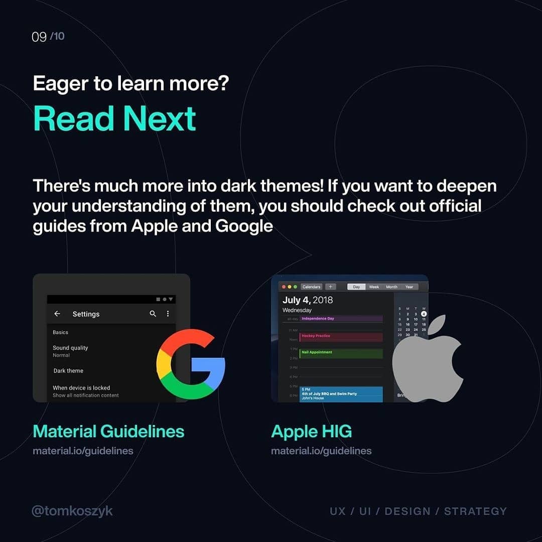
I decided to put together a list of tips! I based those on Material Design Guidelines and Apple HIG for dark themes and my own experiences from designing Holo Music (btw. Holo Music comes with light and dark theme since before it was trendy! :)).
.
I hope this shortlist will help you in your future design projects. You’ll learn about:
1️⃣ The contrast in Dark UI
2️⃣ Using accent colours
3️⃣ What are the psychological differences
4️⃣ How to add dimensional feel too dark UI
5️⃣ What to read next
.
As usual, if you have any questions or suggestions, leave them in comments, and I’ll make sure to answer them! Cheers, and have a great weekend!


