8 Tips On Grids in Interface Design
8 Tips On Grids in Interface Design 🔥
-
By: @lubosvolkov
-
__________
You often ask me about design grids systems … In today's post we are going to look in to that with the nice practical visual examples … Let’s do that.
__________
🧐 Why are grids so important?
____
They work as the skeleton framework for the page’s layout … It helps you with organisations of elements on the screen … They make it easier to collaborate on designs by providing a plan for where to place important elements on the screen.
.
What you will find in the post?
____
1️⃣ Main benefits of grid usage
2️⃣ Important terminology
3️⃣ Popular grid systems
4️⃣ Responsive grids
5️⃣ Usage
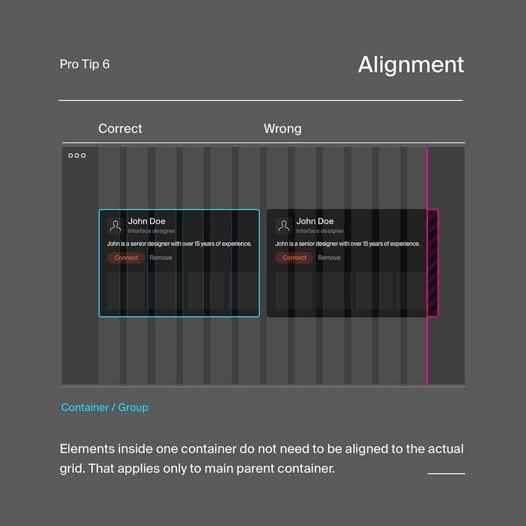
6️⃣ Alignment
7️⃣ Experiments
8️⃣ Valuable resources
.
🤯 Key takeaways
____
Grids should help you... If you do not know which grid to use start with simple bootstrap grid ... If one system is not working try different one … Eventually for simple projects you can use your eyes ... You can align interface elements manually … Last but not least try experiment with custom grids.
__________
➡️ Do you like this type of the post? Let me know in the comments it will make me happy!


