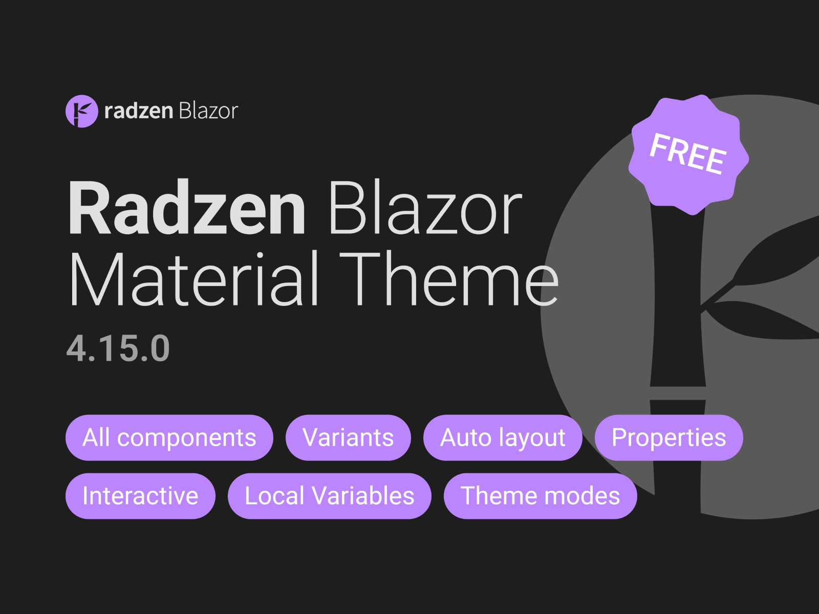
Radzen Blazor Material Theme UI kit
Compatible with
Personal & Commercial Use
License info
Highlights
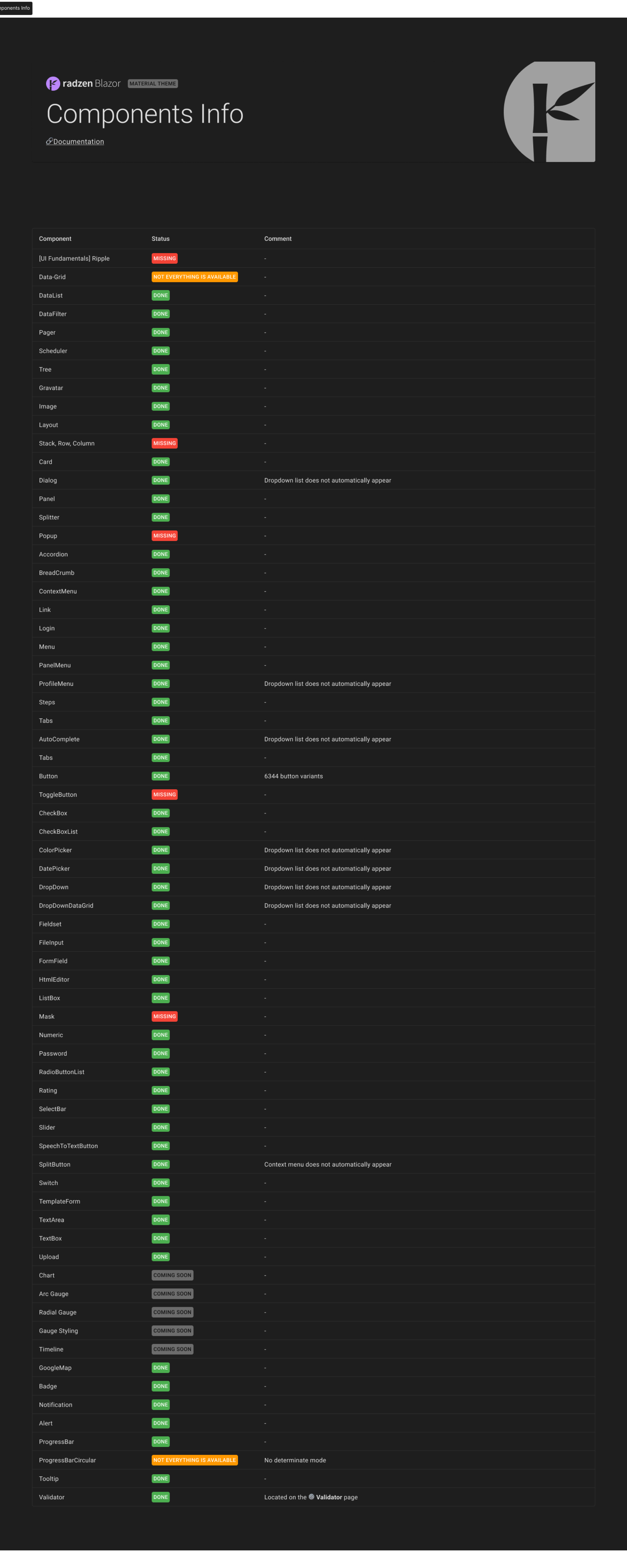
50+ detailed components
Maximum interactive components
Fundamental basis on variables
All components 100% free
Radzen Blazor Material Theme documentation
Auto layout, Properties and Variants
Overview
Hello 👋
Without further ado, straight to the point:
📌 My goal was to help my fellow UI designers who have developers using the new Blazor and Radzen technology. This is a big job for you, colleagues. I hope it will help to prototype faster and improve communication with developers.
📌 It was a big test for me to make such work, because I had never done such work from scratch. And when I write this text, I proudly understand: “It was a long time, but I managed and did everything myself.”
📌 This work is distributed absolutely free of charge, but I will be pleased if you support me.
📌 I want to express my gratitude to my family, friends, colleagues for their support, the Radzen team, without whom this work would not have been possible at all, and to the Figma tool, without which I could not have found my dream job.
Documentation
🔗 Radzen Blazor Material Theme - https://www.radzen.com/blazor-components/
Links
🔗 Figma - https://www.figma.com/community/file/1279184032118946774/Radzen-Blazor-Material-Theme
🔗 My Behance - https://www.behance.net/designbyskalkin
🔗 Support me on boosty.to - https://boosty.to/designbyskalkin
My name is Alexey Skalkin
And I speak the language of design
🌟 Good luck everyone!
Release notes
💫 25.11.2023. 4.15.0
> ⭐ Updated ProgressBar indeterminate mode
> ⚙️ Rework component "Badge"
> ⚙️ Rework component "Header"
> ⚙️ Rework component "Card"
> 🔧 Fixed Slider component
> 🔧 Fixed Numeric disable-color
> 🔧 Fixed rz-dialog-titlebar-close
> 🔧 Fixed background-color for Dropdown/single_selection/dropdown-panel and Dropdown/multiple_selection/dropdown-panel
> 🔧 Fixed ContextMenu
> ✏️ Renamed the "rz" property to "Style" for all Buttons and SplitButtons.
> ✏️ Renamed the "Sizes" property to "Size" for all Buttons and SplitButtons.
> ✏️ Renamed component “PanelMenu” to “PanelMenu_collapse”.
> ➕ Add variable “item-seporator-background-color” for separator in the component Context menu
> ➕ Add Panel-menu_item_dafault
> ❌ Deleted Other_components_SplitButton
More UI Kits
Explore
![E-commerce Templates & UI Kit [FREE] cover image](https://uibundle.s3.amazonaws.com/images/product-cover-1750427357-cover-free-png)


