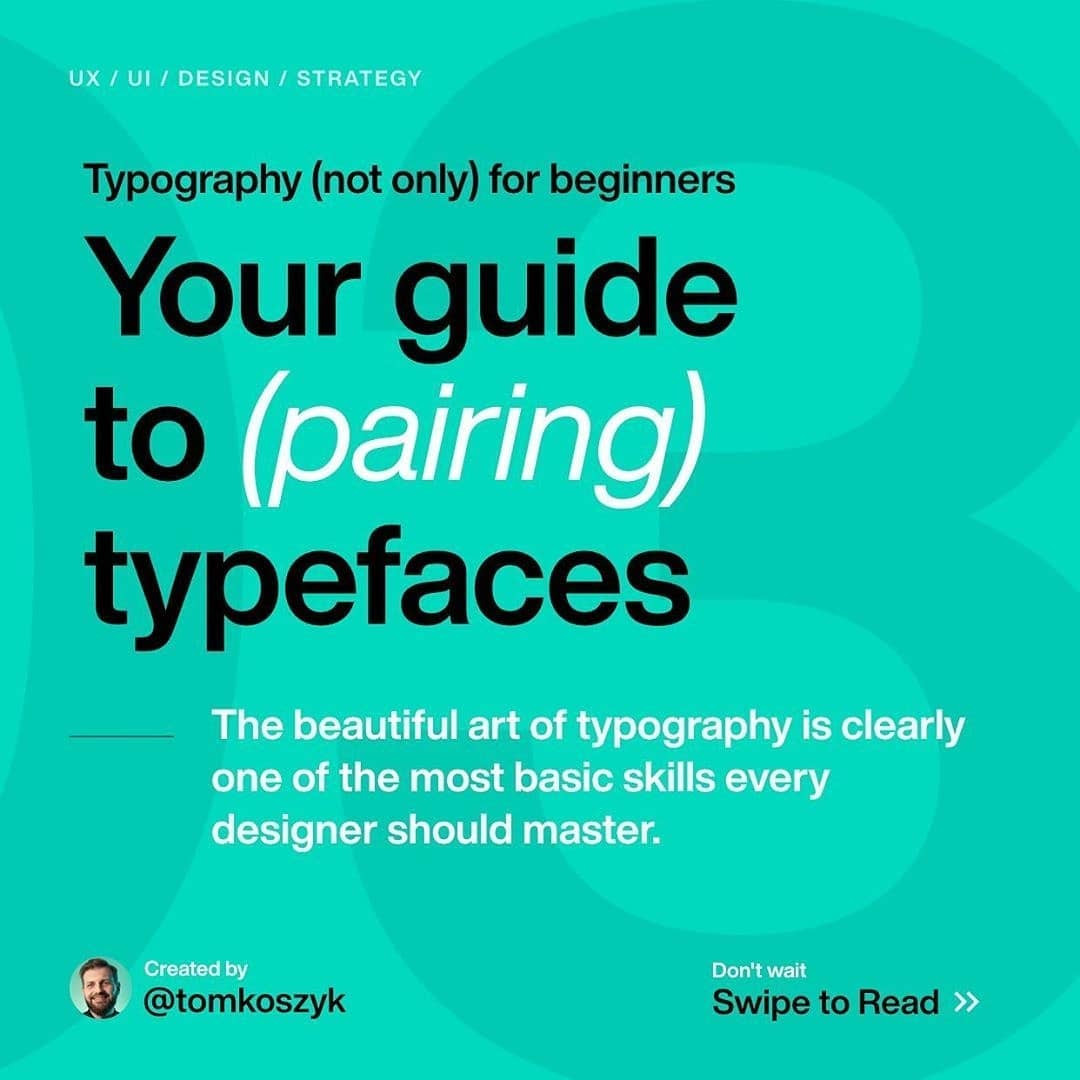


Your guide to (pairing) typefaces
Typography 103📖⠀
-
By: @tomkoszyk
-
Last week we talked about choosing the right typeface... now it’s time to make the next step and focus on pairing our typeface with other ones!⠀
.⠀
Pairing fonts is much easier than you can think. There are very few rules carved in stone you need to remember (x-height for example). That being said, to make a perfect match you’ll need a lot of experience and a good eye. Here are things i consider before pairing typefaces⠀
.⠀
1️⃣. Do i really need to?⠀
The first question is do you need another typeface? Maybe your goal can be achieved with only one, just used in a good way?⠀
-
2️⃣. Style⠀
Font styles need to match. There are two ways you can go, either pair fonts with similar style, or choose one distinctive and one neutral.⠀
-
3️⃣. Variation⠀
If you decide to pair fonts you need to make sure they’re distinctive enough so people can tell difference.⠀
-
4️⃣. Rhythm⠀
Both typefaces needs to have matching proportions, so it’s not disturbing to an eye, switching between them.⠀
-
5️⃣. Limits⠀
Do not overdo, limit number of fonts you use!⠀
.⠀
Do you find it interesting? Would you like to learn more, on that, or maybe not? Let me know in comments!


