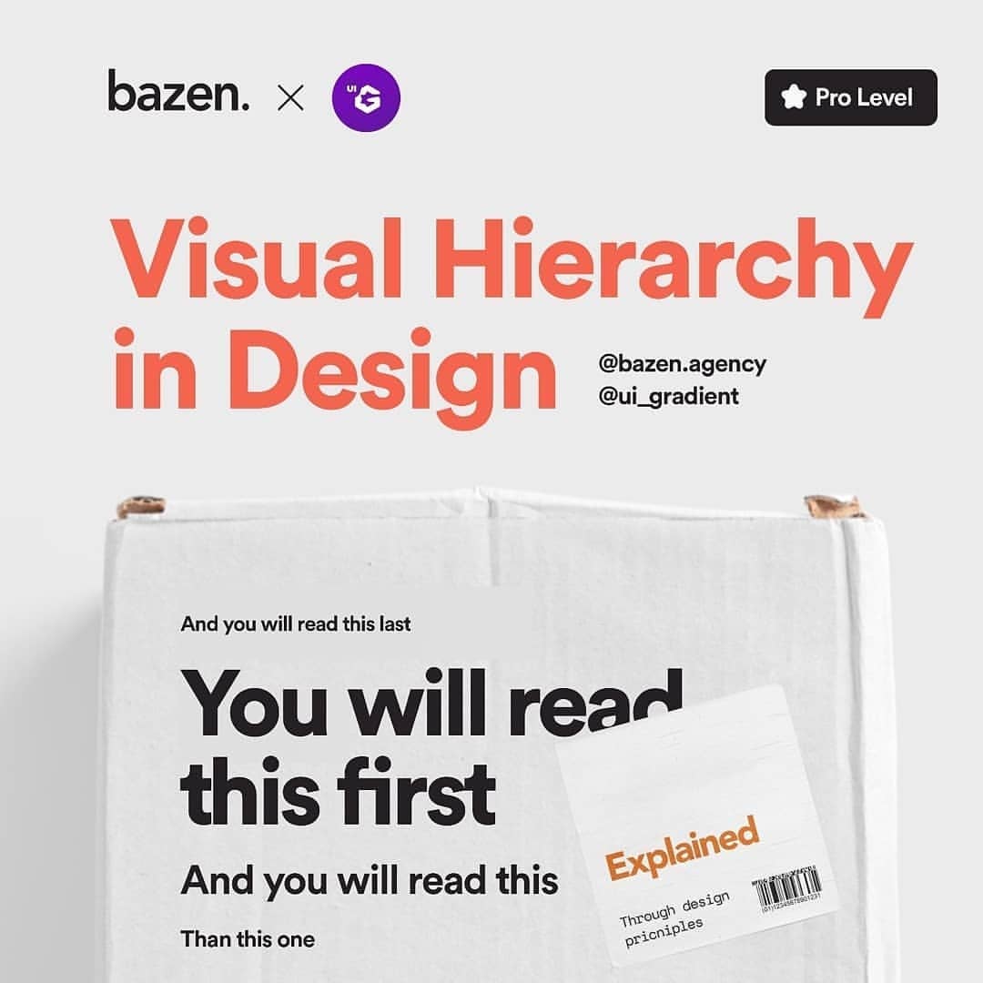
Visual Hierarchy in Design
⚡ Visual hierarchy in design
-
@bazen.agency
-
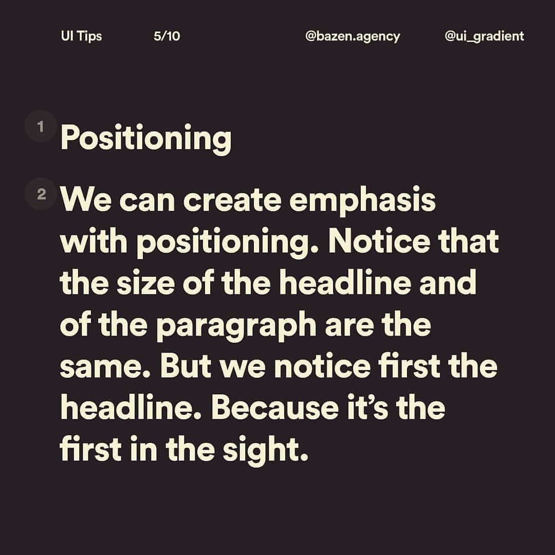
Visual hierarchy helps describe the importance of elements in a composition. It can help lead your audience through an entire message. Good design can attract the viewer to the “whole” and lead them through it's “parts” by creating different levels of priority and intuitive flow. 🏄♀️
tip by @stefan.tosh
design by @marko.dostanic
_
Use different scale to establish relation between objects. Depending on the importance and the function of the element, you will use different scale and weight. 📐
_
Break the monotony using images, various colors and spacing. You don't want to have a dull design, so mix it up!
_
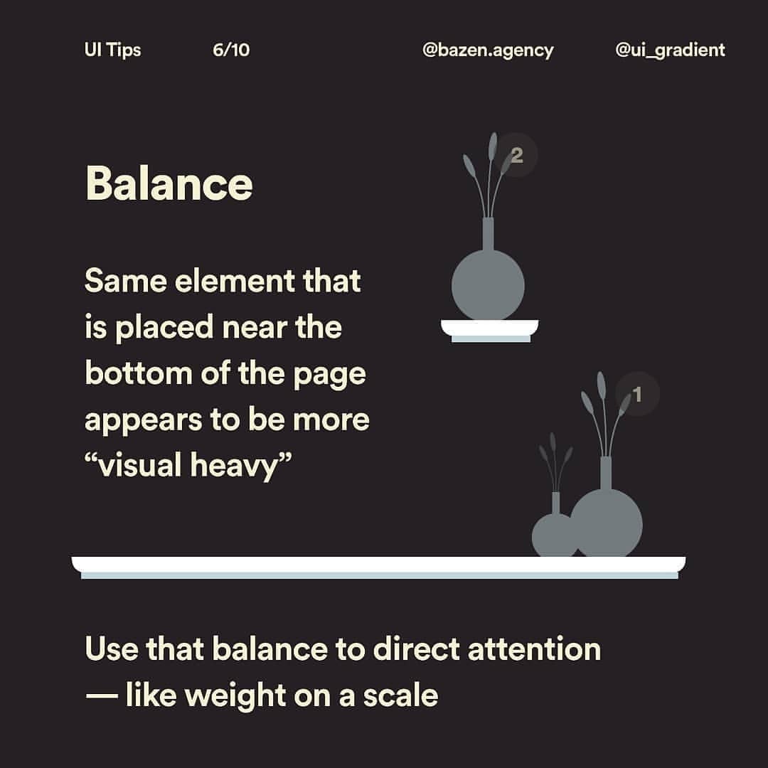
It's also important to determine the focal point - you don't want other elements to mix and distract your audience from the main message. Always try to maintain balance with scaling of elements. ⚖️
_
What methods do you use to make a cool design? Are you familiar with these rules?
_
If you have anything to add, please tell us so in the comment section! 💬❤️


