Tips On Inputs in Interface Design
8 Tips On Inputs in Interface Design 🔥
-
Author: @lubosvolkov
-
Inputs are an essential part of every digital interface … In today's post we are going to look at some visual examples and actionable tips how to improve your input designs … Let’s do that.
________
🧐 Why are inputs so important?
__
Primary goal of inputs or text fields is allowing users to insert their data in to the digital products ... They are so essential part of every interface that we often forget how important they actually are … If they are done right they can improve overall user experience … Or generate more revenue for the business.
.
What you will find in the post?
__
1️⃣ Inputs have voice and tone
2️⃣ Anatomy of the input field
3️⃣ Input types
4️⃣ Display inline error messages
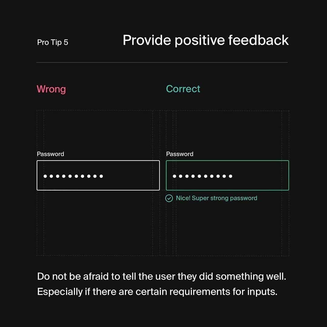
5️⃣ Provide positive feedback
6️⃣ Use input formatting masks
7️⃣ Focus on accessibility
8️⃣ Valuable articles, softwares & books
.
🤯 Key takeaways
__
Inputs are key elements of every interface … You should craft them with attention to details such as padding, font size or accessibility … Try to also think about edge cases such as error states and success states … Lastly make sure all input fields are grouped together in the logical order.
________
➡️ Do you like this type of the post? Let me know in the comments it will make me happy!


