


Tips On Icons in Interface Design
8 Tips On Icons in Interface Design 🔥
-
Author: @lubosvolkov
-
__________
Icons are a fundamental part of digital interfaces … In today's post, we are going to have a deeper look into icon construction, usability and other tricks which will help you to choose better icons.
__________
🧐 Why we are using icons in the first place?
____
Icons are not just images ... They play a crucial role in the overall user experience ... They help the user with navigation in digital environments ... Along with that, they provide a nice visual break in the layouts and they support the storytelling.
.
Actionable tips
____
1️⃣ Why are icons actually good?
2️⃣ Focus on style consistency
3️⃣ Icons need to be recognizable
4️⃣ Try to use icons with labels if possible
5️⃣ Icons have voice and tone
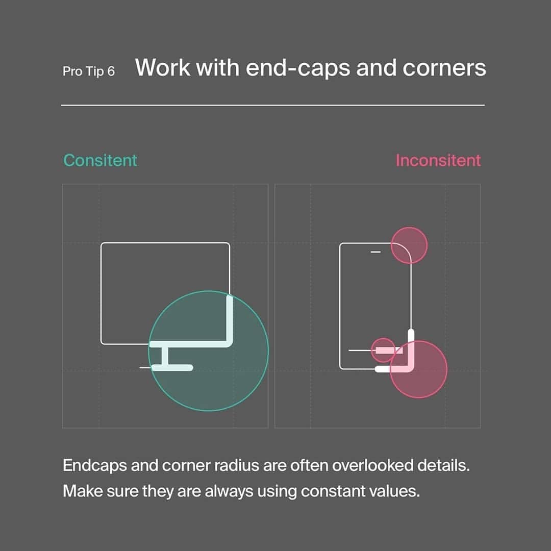
6️⃣ Work with end-caps and corners
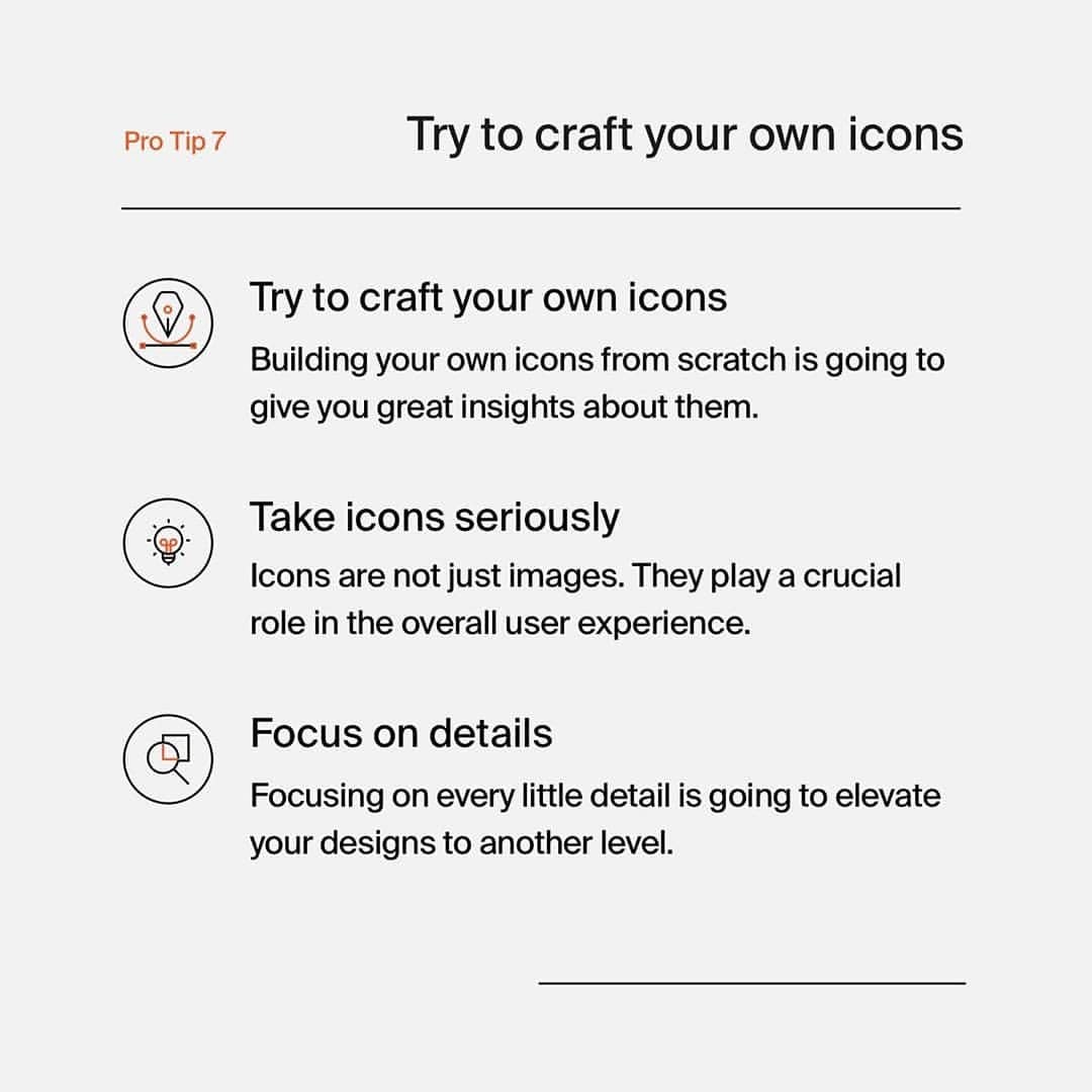
7️⃣ Try to craft your own icons
8️⃣ Valuable icon resources
.
🤯 Key takeaways
____
Icons should be chosen carefully ... Try to focus on the usability of the icons ... Avoid a way to abstract icons and try to add labels whenever possible ... Do not also forget about the voice and tone of the icons ... Lastly, treat icons with respect.
__________
❤️ Would you like to see similar tip posts like this more often? … No worries! I will keep sharing my other photos and designs!


