


The 4 Principles of Design
Creating a good design is not so difficult if we keep some basic rules in mind 🧠 The interesting thing about is that those principles are the same ones for any kind of design: Print, graphic, illustration or UX / UI Design etc.
.
〰️ Whenever you want to grab your audience’s attention, you’ll want to create a message that appeals to their senses 📩
Specifically, basic design skills can help you brand your UI Design and present your message in a professional, creative way 💥 .
.
.
〰️ 1. ALLIGNMENT 🎹
Alignment helps you to organize the elements on your design.
As a general rule, the edges of your images should line up with the margins of your text. This principle generates clean lines and plenty of white space that appeal to your readers visually.
.
〰️ 2. REPETITION 📱
Repetition means that you should reuse some key themes in your design so that readers can easily recognize and identify your pattern or your design Brand in general. You can also utilize repetition with the shapes and elements you use.
.
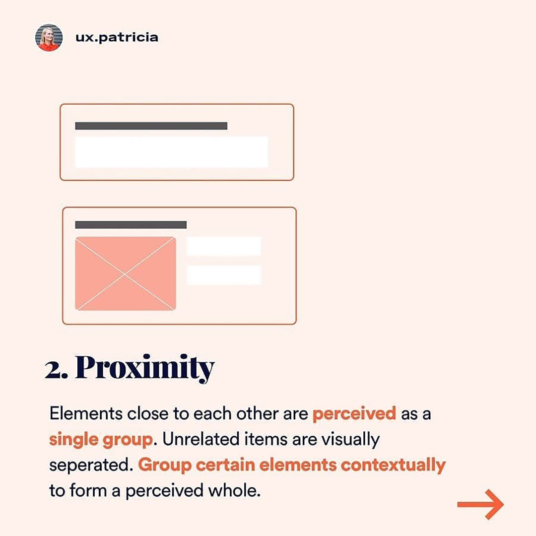
〰️ 3. Proximity 🧮
When you place the relevant elements and words close to each other on the page, you send a visual signal to the reader that these elements have something in common and belong together some how.
So your user can quickly analyze the most important details of your design and internalize your message.
.
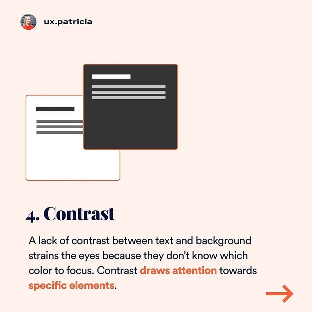
〰️ 4. CONTRAST 📤
Different colors, shapes, and sizes will draw your readers’ attention best. It helps to choose a color scheme that combines light and dark shades. So stick to two or three different design elements to keep your layout unified and keep the focus on your most important elements.


