How to use shapes in UI
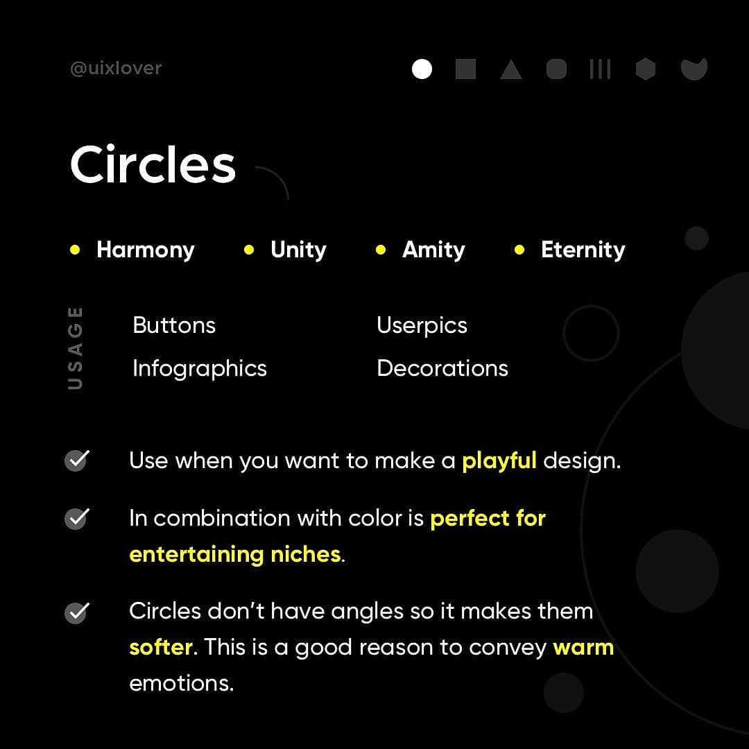
The shapes of objects in your design may be sending a message to users that you aren’t even aware of. Whether you put an image inside a square or circle or triangle can have an impact on what people think about that UI, illustration or logo.
Here, we will look at common shapes used in design projects and the signals they may convey.
If this is actually useful, please leave a comment or tag a friend.
Put 🔥 in comments if you want to learn part 2 “Top 7 shape styles”.
Thank you so much for your support guys 🖤


