Gestalt Principles in UX/UI Design - Part 2
⚡Gestalt Principles in UX/UI Design - Part 2
-
@bazen.agency
-
In the previous UI Tip we've introduced you to theory and Gestalt principles. Today we will dive a little deeper into this topic.
Have you ever heard of this or is it completely new to you?
In this post, we explain to you how much psychology and design principles are actually related.
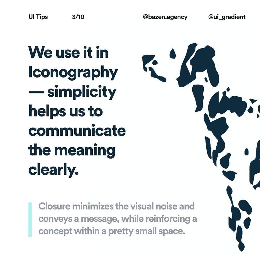
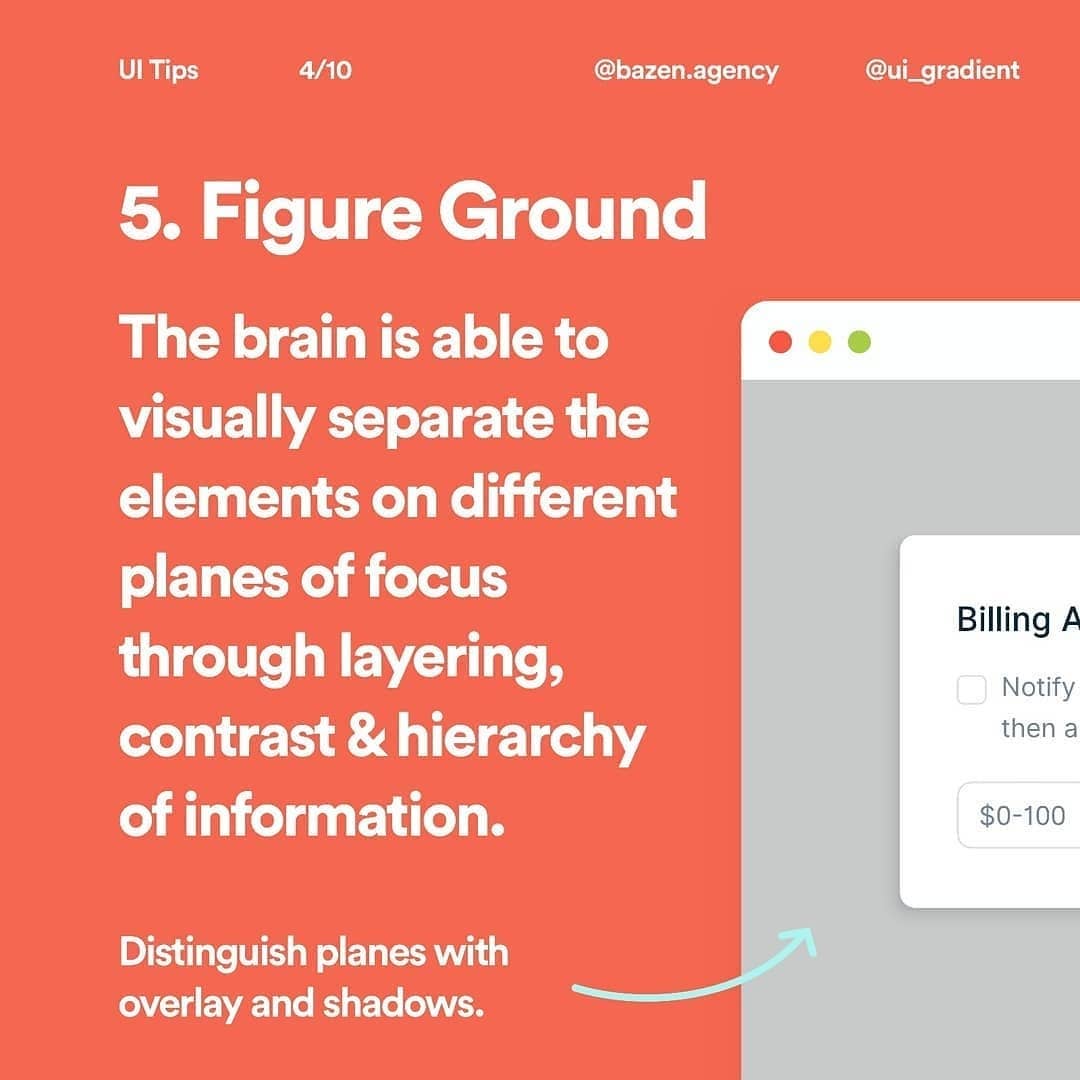
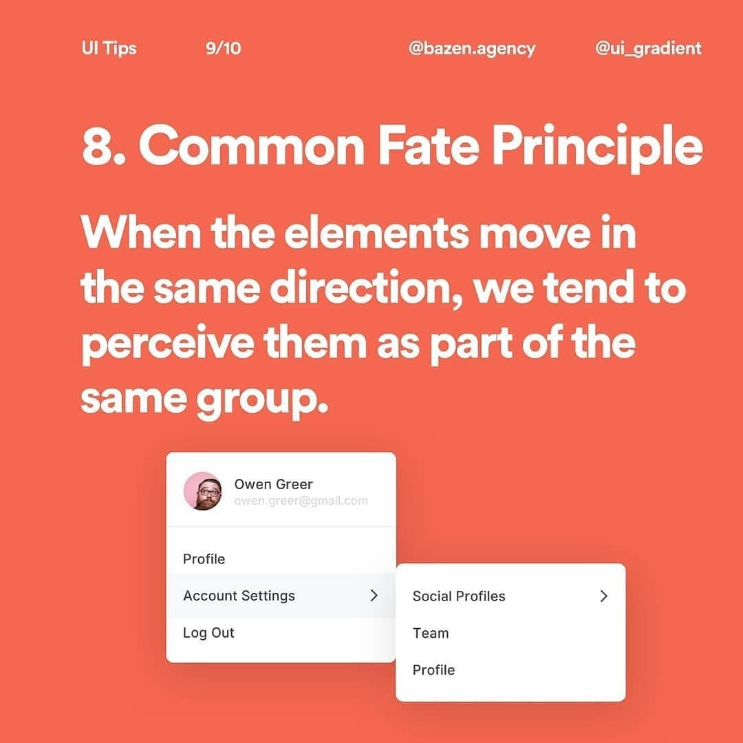
How do we find meaning in what we see? How do we understand the context? Why can we distinguish the background from the figure? How is a sense of stability and order achieved? How can the movement of the elements affect perception? These are just some of the questions Gestalt gives us.
These principles explain how and why our brain perceives certain things as a whole and a group and how to achieve this effect?
Can you answer these questions? We'd like to know! Tell us in the comments! ❤️ If you want to see a complete explanation and many more cool examples, visit our YouTube channel bazen. and watch the episode "How to Create an Invisible Frame in UI Design (Gestalt Principles)"

