Designing For Accessibility - 7 Simple Tips for Your Designs
⚡ Designing For Accessibility – 7 Simple Tips for Your Designs
-
@lubosvolkov
-
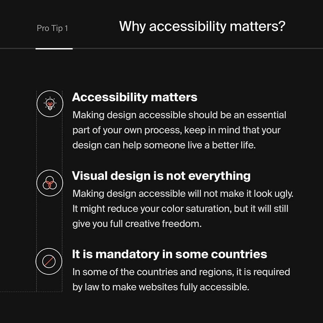
Designing with accessibility on the mind should be standard ... However, there are still so many products which are not accessible ... We as designers should help people with limited vision or other disabilities to have good user experience as possible.
____________
📌Why you should read this post?
______
There is a huge amount of people with limited vision, colorblindness, and other disabilities ... However, that should not prevent them from having a good user experience with the web or mobile products ... In today's post you will learn how to create more accessible user interfaces ... This will be beneficial for both regular and disabled users so definitely read it.
.
What you will find in the post?
______
1️⃣Why accessibility matters?
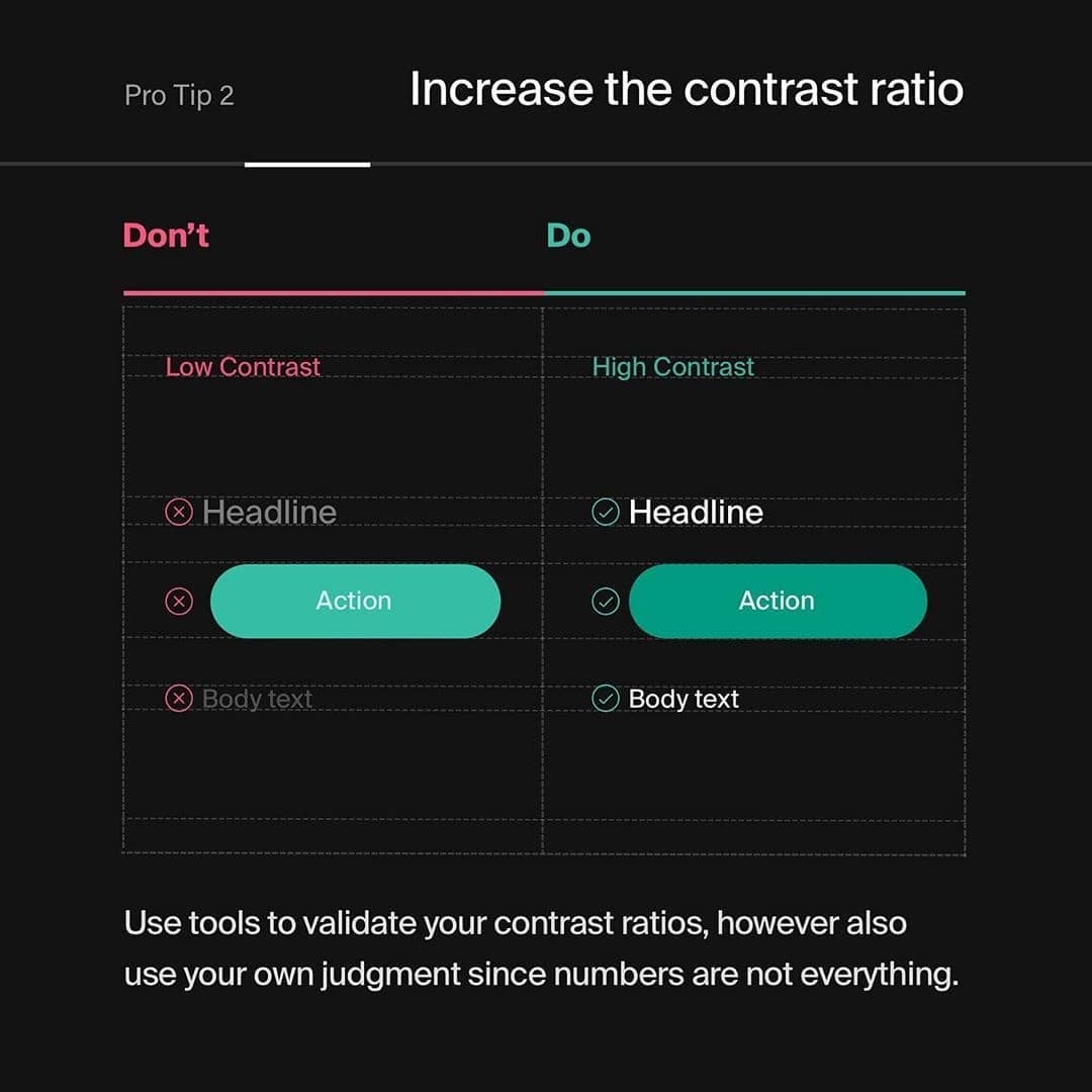
2️⃣Increase the contrast ratio
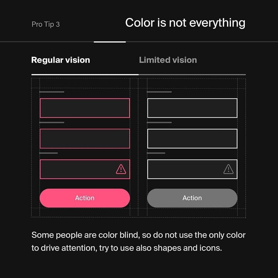
3️⃣Color is not everything
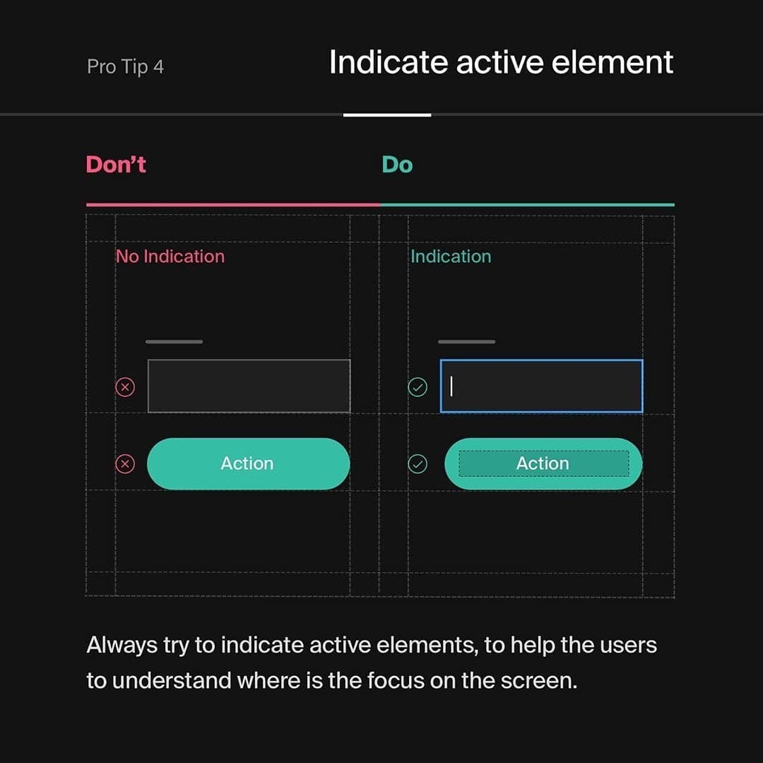
4️⃣Indicate active element
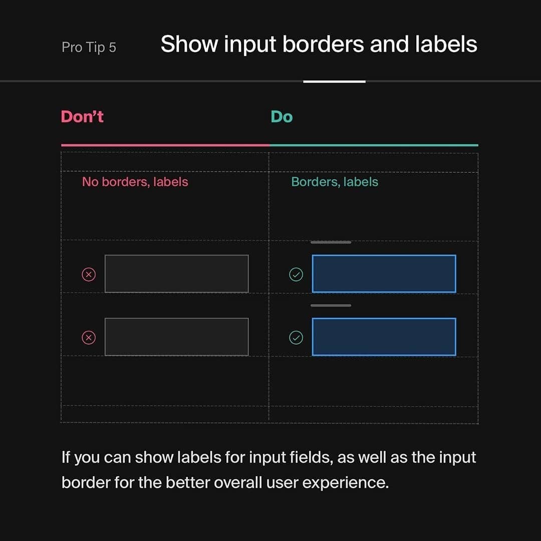
5️⃣Show input borders and labels
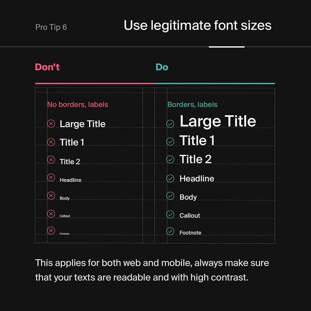
6️⃣Use legitimate font sizes
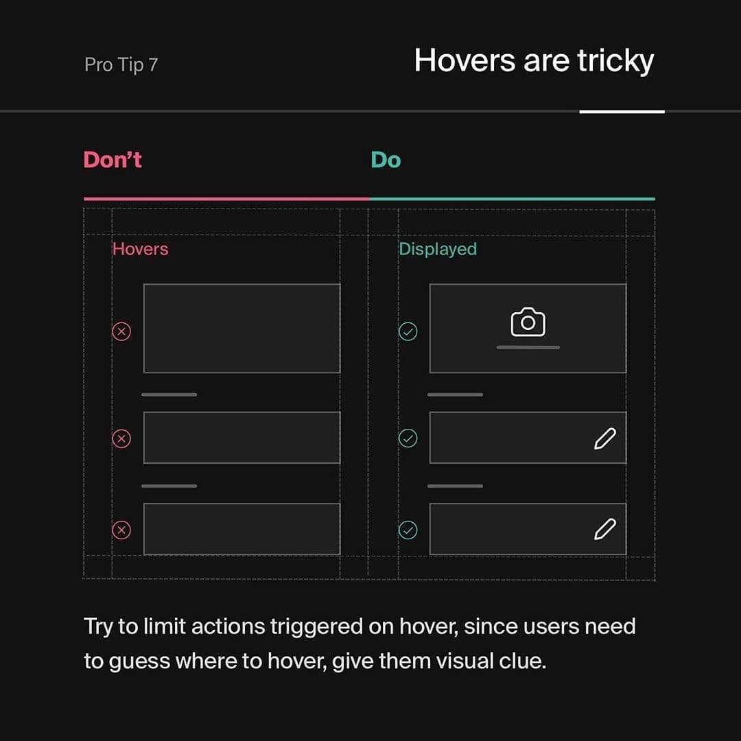
7️⃣Hovers are tricky
8️⃣Important takeaways
.
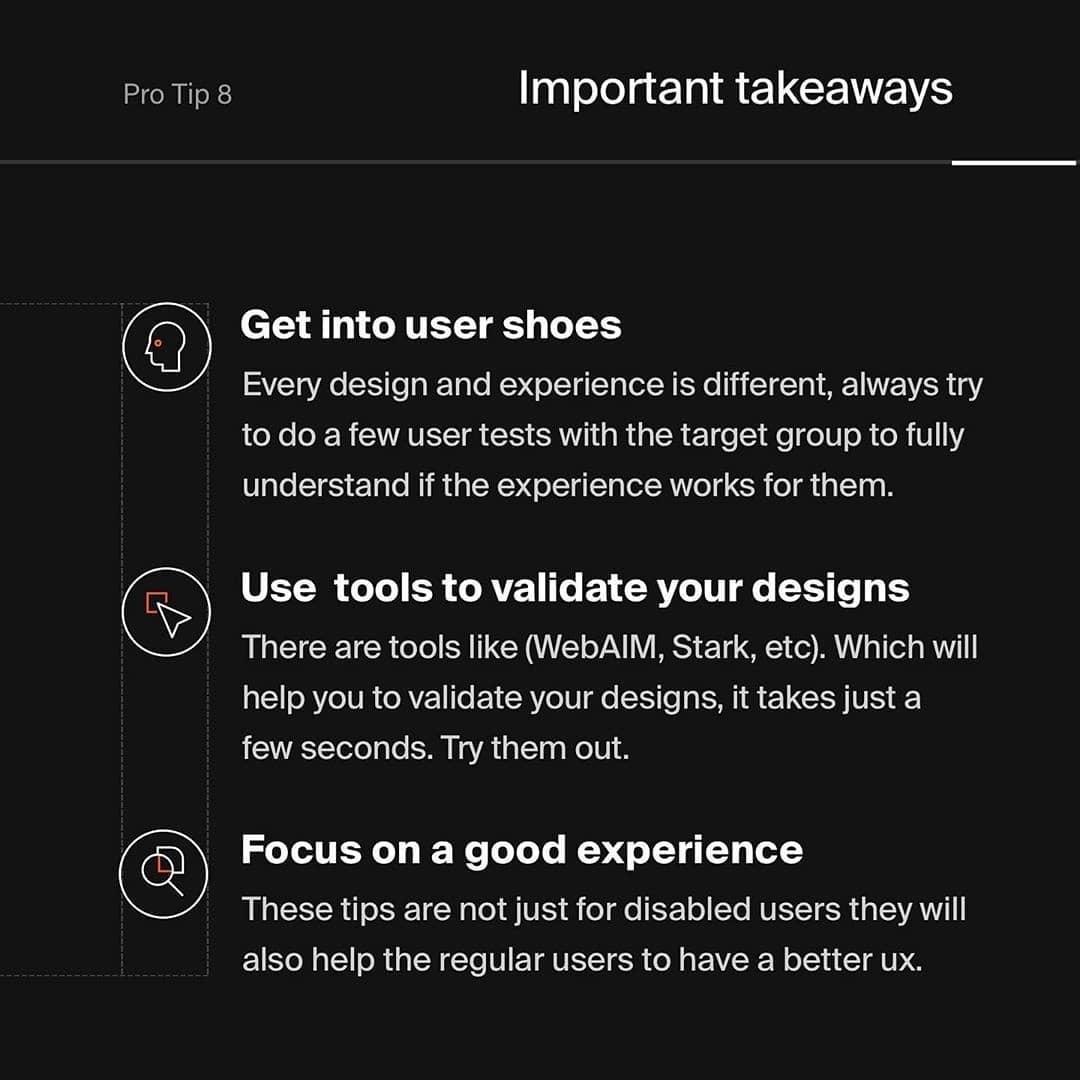
🤯 Key takeaways
______
Always test out your designs with the real users (ideally with one or two people with vision issues) ... That is going to help you to validate your design decisions ... However, if you do not have access to test users you can use contrast checkers such as (WebAIM, Stark, etc) ... But contrast they are not everything be careful with them especially if you are testing white text on colored background since results can be misleading ... Trust your own judgment.


