Designing Empty States
Often time we as designers ignore empty states. In this post, I will give my thoughts on those small but significant screens.
__
Some of the best UX practices for making empty screens more useful, helpful and informative.
__
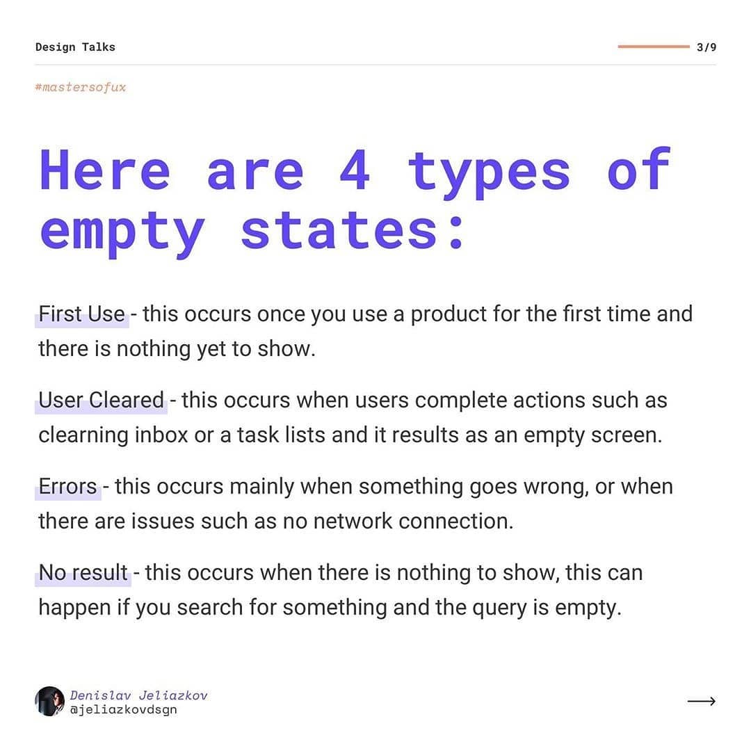
Here are 4 types of empty states:
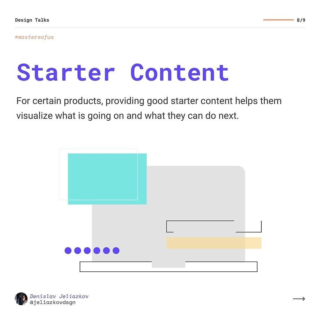
First Use - this occurs once you use a product for the first time and there is nothing yet to show.
User Cleared - this occurs when users complete actions such as cleaning inbox or a task lists and it results as an empty screen.
Errors - this occurs mainly when something goes wrong, or when there are issues such as no network connection.
No result - this occurs when there is nothing to show, this can happen if you search for something and the query is empty.
___
What are your thoughts on empty states? Leave your feedback below!
