Best Practices Designing Cards Part 1
First part of some tips to design cards ✌️ 🚀
-
By: @christvizcarra
-
1️⃣All is in the details
Borders and shadows help to contrast cards with the background. What happen if you have a white card in white background? .
.
.
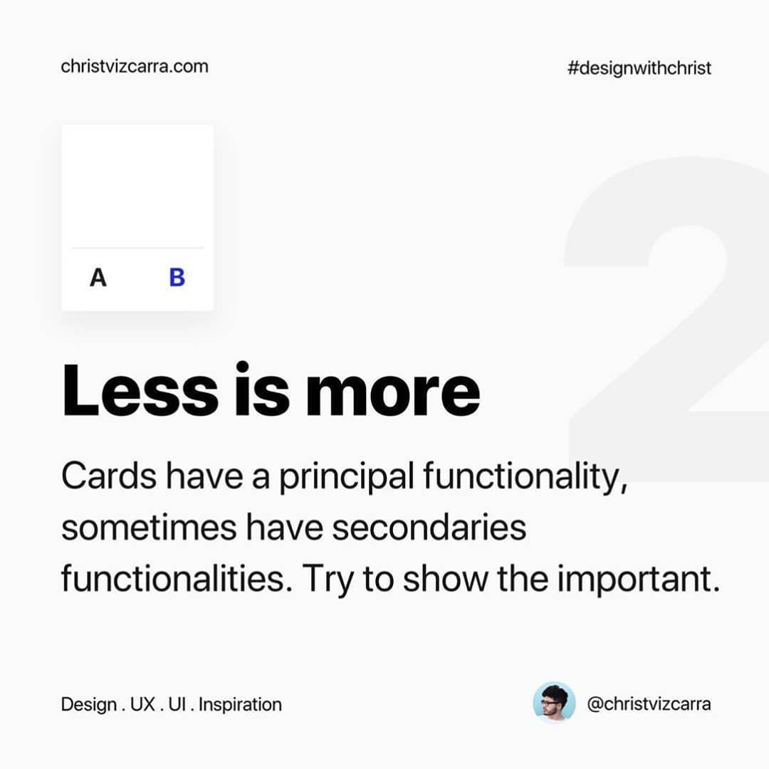
2️⃣Less is more
Cards have a principal functionality, sometimes have secondaries functionalities. Try to show the important.
.
.
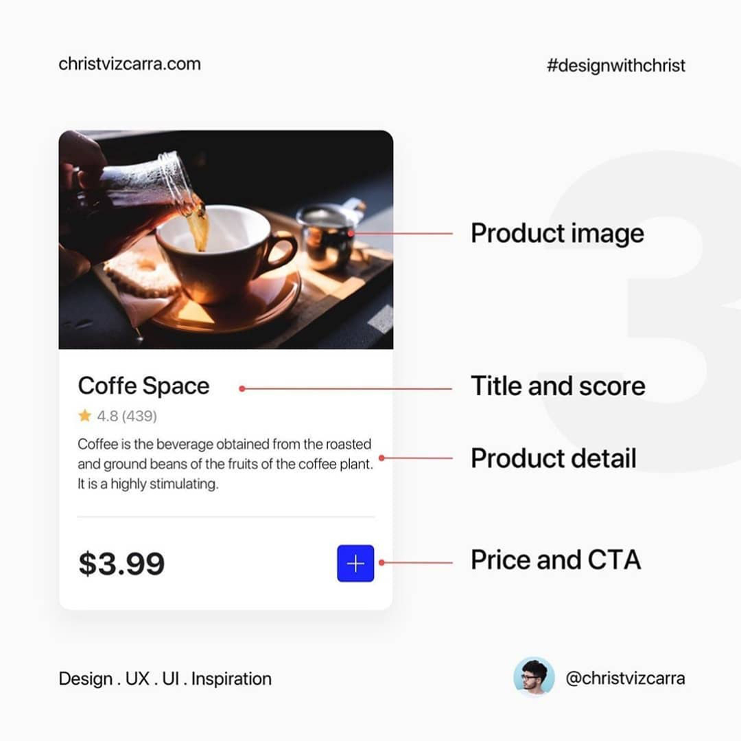
3️⃣Content is key
Cards gather important information and often show clues to the content inside them. What is the best content for cards?.
.
.
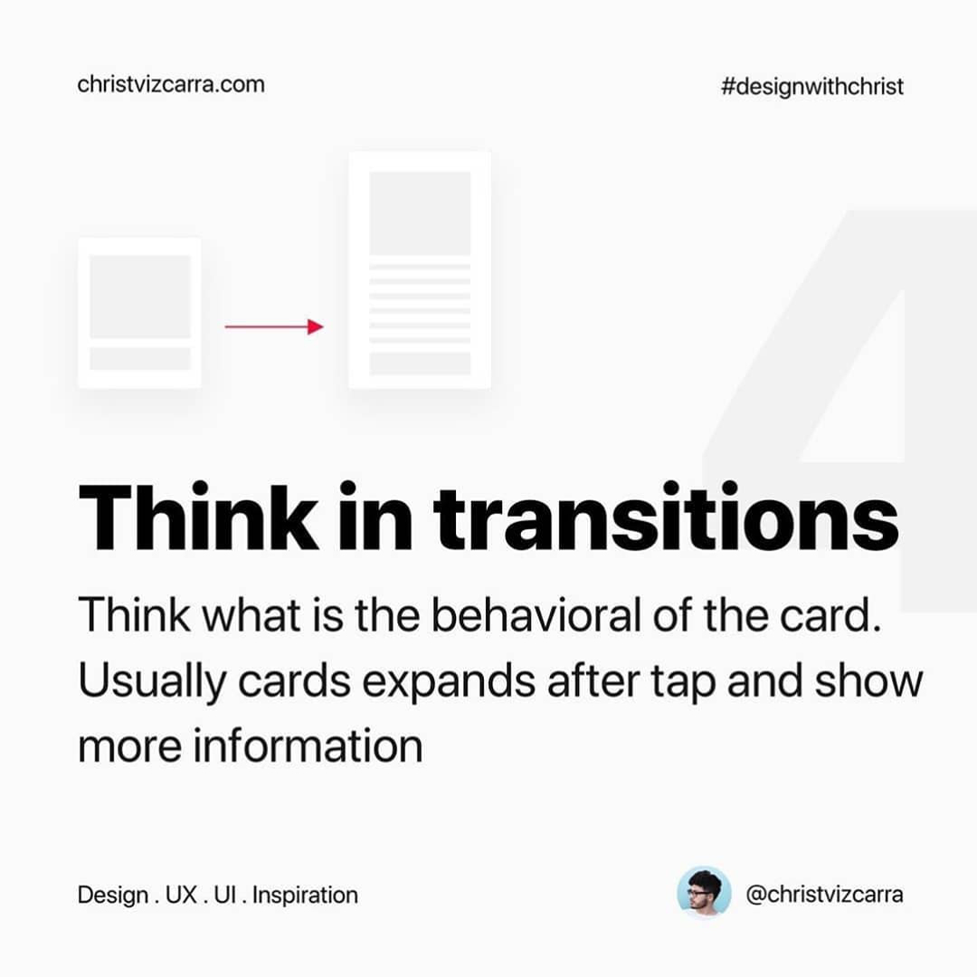
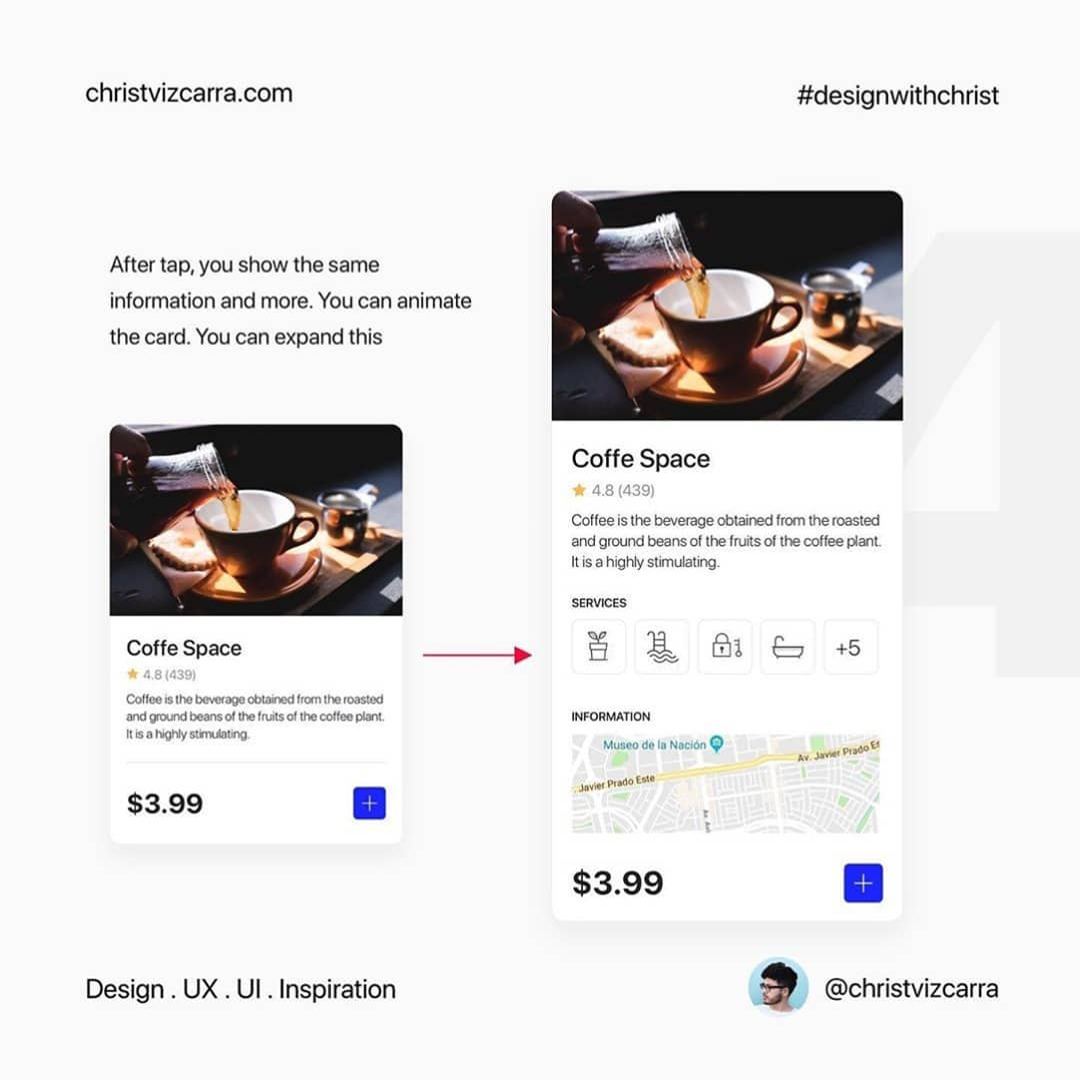
4️⃣Think in transitions
Think what is the behavioral of the card. Usually cards expands after tap and show more information


