


8 tips to card shadows
💡 8 tips to card shadows
🎉 Celebrating the 3rd in the card series with a cracker!
🤪 Shadows are hard to get right. You’ll see screenshots on dribbble and think how do they get that shadow? Well follow these tips to master shadows across your design! Especially when it comes to cards.
👆👇 The y-axis is the crucial one when it comes to cards. Majority of the time you’ll be dealing with a positive value creating a drop shadow.
👈👉 The x-axis creates a left or right shadow and with the growth in interactions these are booming right now so be aware and practice them.
👁 The z-axis is the optical illusion of depth or elevation. Although we design pictures beneath glass, the depth of shadows raises it from the base layer creating more prominence. Focus on this during hover states.
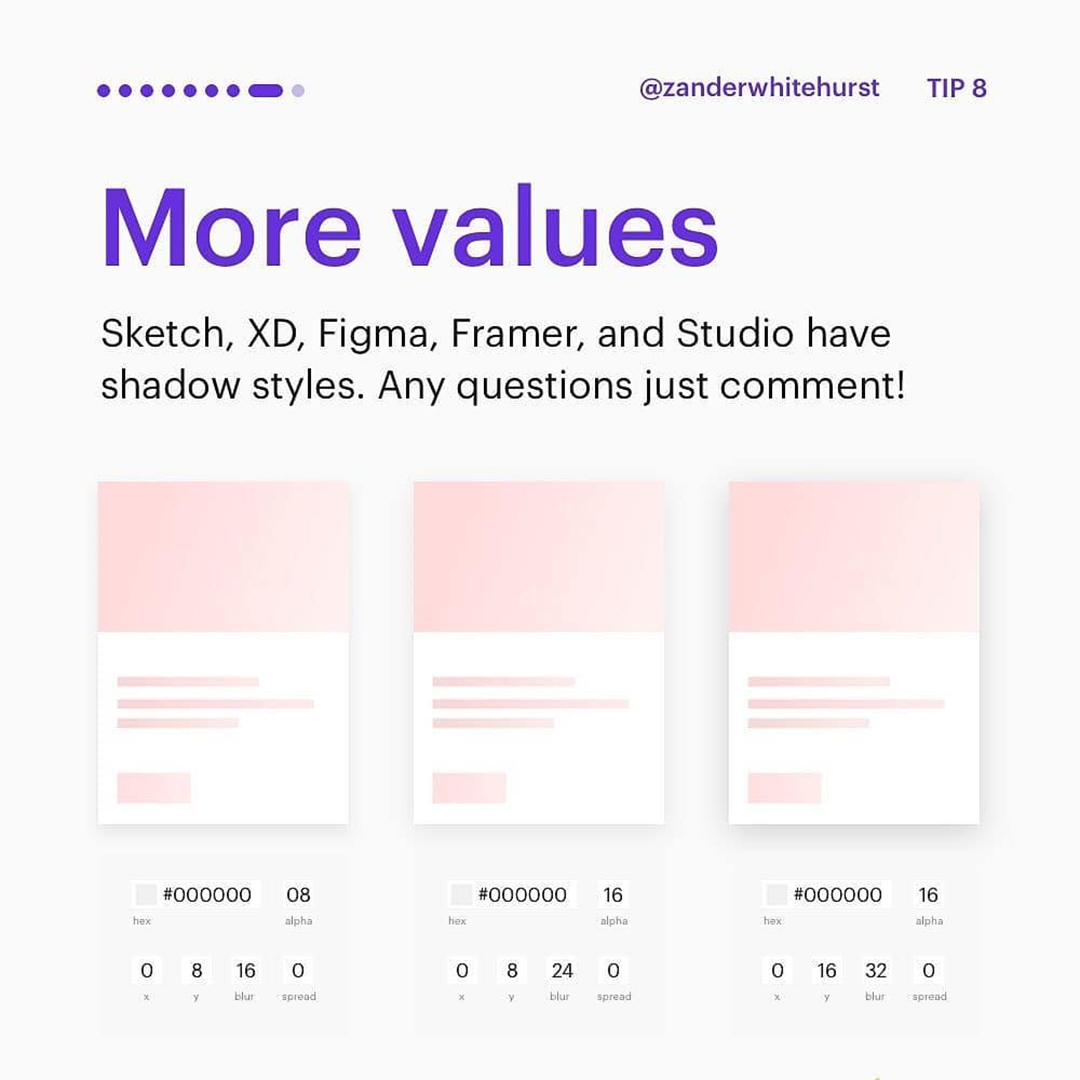
🎨 Colose wise stick to #000 and use the alpha to create opacity. The lower the alpha the more subtle the shadow.
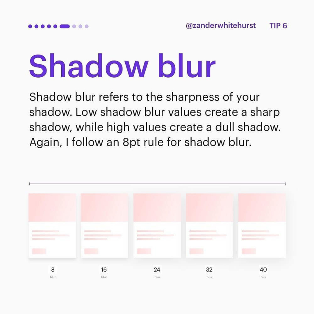
👅 The shadow blue refers to sharpness. The lower the value the sharper the shadow, so create texture and ambience with higher values.
🙌 As a huge thank you for all your support I’ve dedicated the last couple micro sections to examples! Follow the 8pt rule for shadows and you’ll be just fine! Enjoy, comment and share with any designers needing shadow help 👍 ..


