


8 layers to perfect button design
🙈 A button is just a rectangle with a value surely? It may seem this simple but your buttons should be designed as a scalable, state based component not just a rectangle. ⠀
⚡️ This article covers every layer your buttons need with exact dimensions and 8pt scaling system. ⠀
⠀
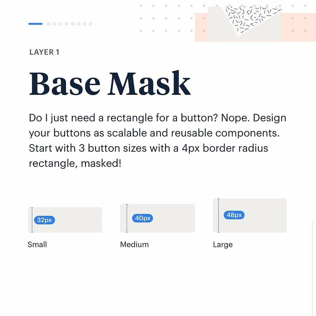
🤦♂️ Every button should begin as a masked base. From here everything within fits the size of your buttons. ⠀
⠀
🐁🐐🐘 Set your button sizes with 32px, 40px and 48px for large buttons ⠀
⠀
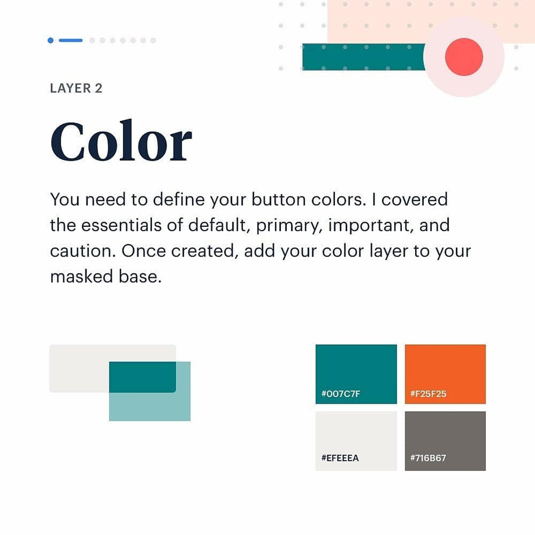
🎨 later on your colors which can be toggled depending on the type of button. ⠀
⠀
🥅 borders should match the colours of your buttons. Layer these in. ⠀
⠀
✅ States are best done with opaque layering vs a darker shade of the button color. This reduces your palette and keep everything consistent. ⠀
⠀
⭐️ Value is the text or icon within the button. Text wise, create your styles using 14px and 16px font size with 24px line height. Super clean for the 8pt system. ⠀
⠀
☁️ Padding wise follow the 8pt rule and scale things nicely with each button size. ⠀
⠀
🔥 Icons should be contained in a square that matches your button masks height. ⠀
⠀
〰️ Constraints. These are so powerful for scaling your buttons dimensions and size! ⠀
⠀
🙌 I hope you find this post useful and start creating component buttons that are reusable and consistent! ⠀


