


5 WAYS TO IMPROVE YOUR UI WITH CONTRAST
⚡ 5 WAYS TO IMPROVE YOUR UI WITH CONTRAST
-
@ognjen.cirovic
-
🤔 WHAT IS CONTRAST? ⠀
Contrast is one of the key design principles. It occurs when two elements have some different properties. Based on those properties human eye treats them as contrasting.⠀
⠀
❗️ WHY IS IT IMPORTANT? ⠀
Because it helps us create and maintain visual hierarchy and rank visual elements in our design. It is our tool for grabbing and focusing user's attention to some particular element.⠀
⠀
USE THESE 5 WAYS TO IMPROVE YOUR UI⠀
⠀
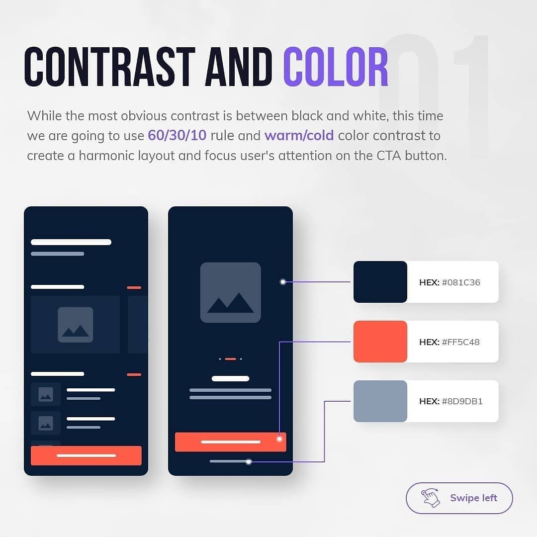
1️⃣ Contrast and color ⠀
Try using differences in hue, saturation, brightness and temperature.⠀
⠀
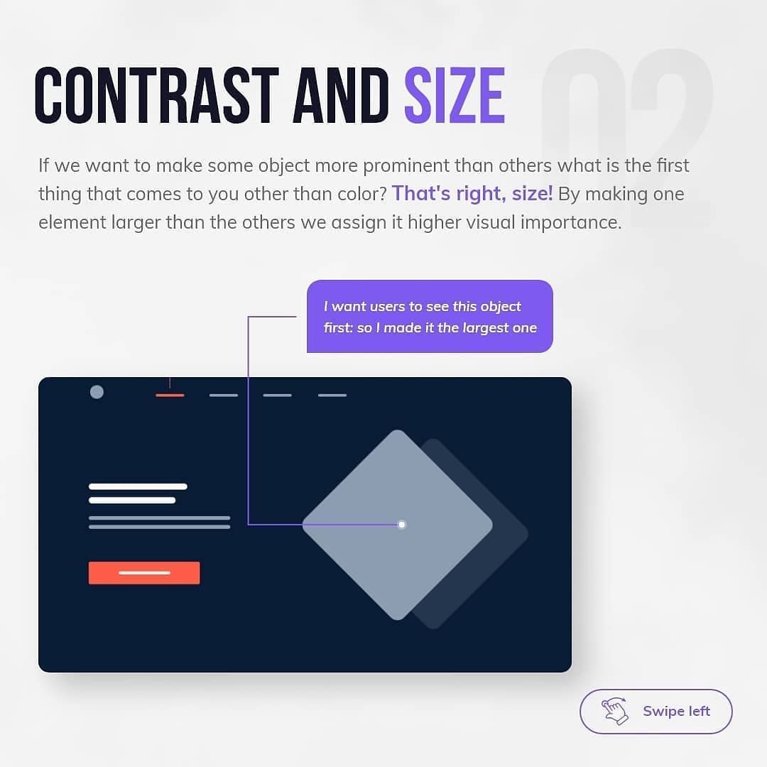
2️⃣ Contrast and size ⠀
If you want to make one element more prominent than the others, make it bigger.⠀
⠀
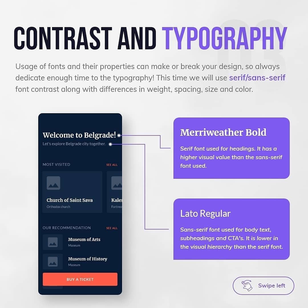
3️⃣ Contrast and typography ⠀
Use serif/sans serif font contrast and different font sizes, weights and spacings.⠀
⠀
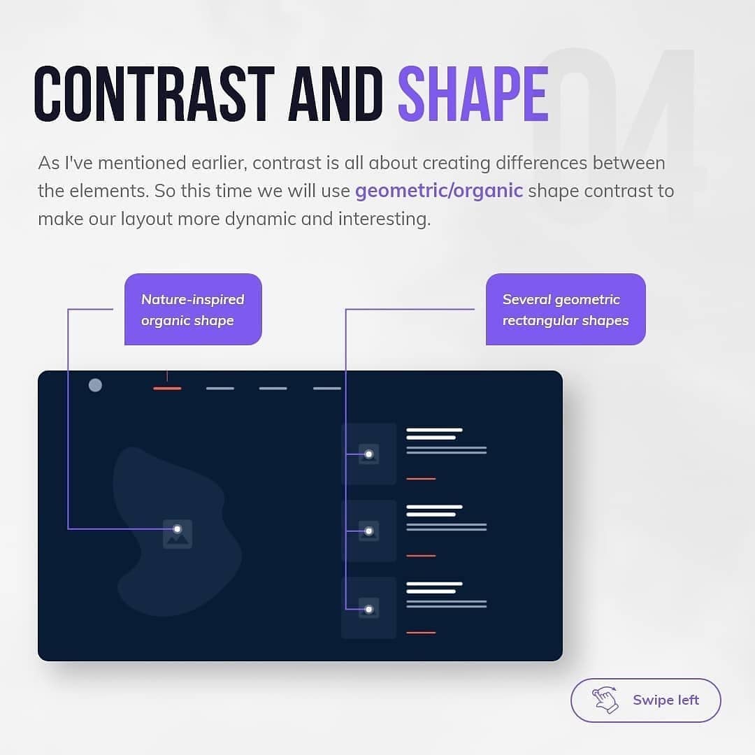
4️⃣ Contrast and shape ⠀
Experiment with geometric/organic shape contrast to create a dynamic layout.⠀
⠀
5️⃣ Contrast and alignment ⠀
Try using different kinds of content alignment such as the center/left one.⠀


