5 Rules For Better Typography
5 Rules For Better Typography🔥🧾
-
By: @acreno
-
Recently I decided to bring my knowledge sharing about design over to Instagram and today is my first post about Typography!
.
🤔 Why you should master typography?
.
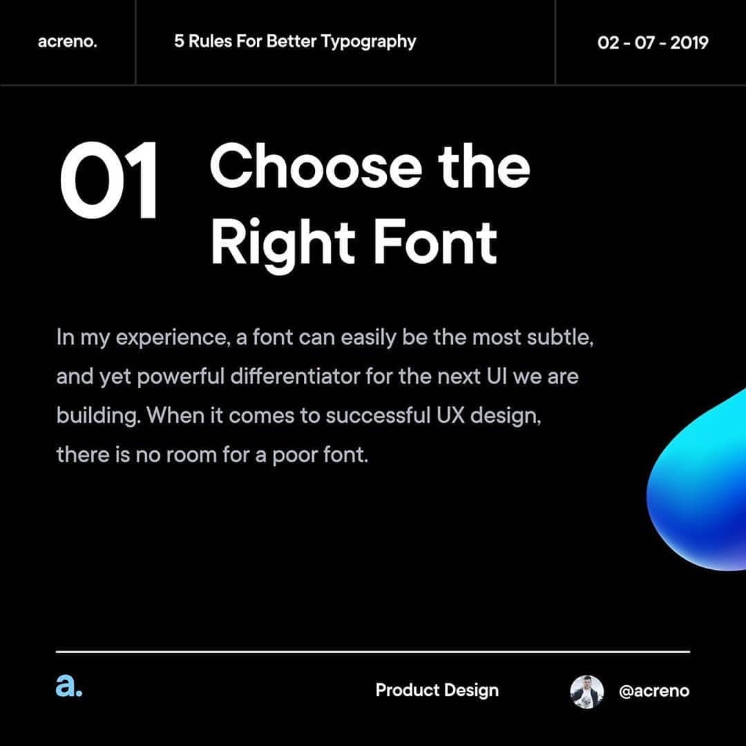
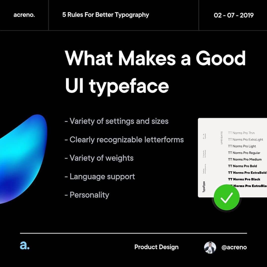
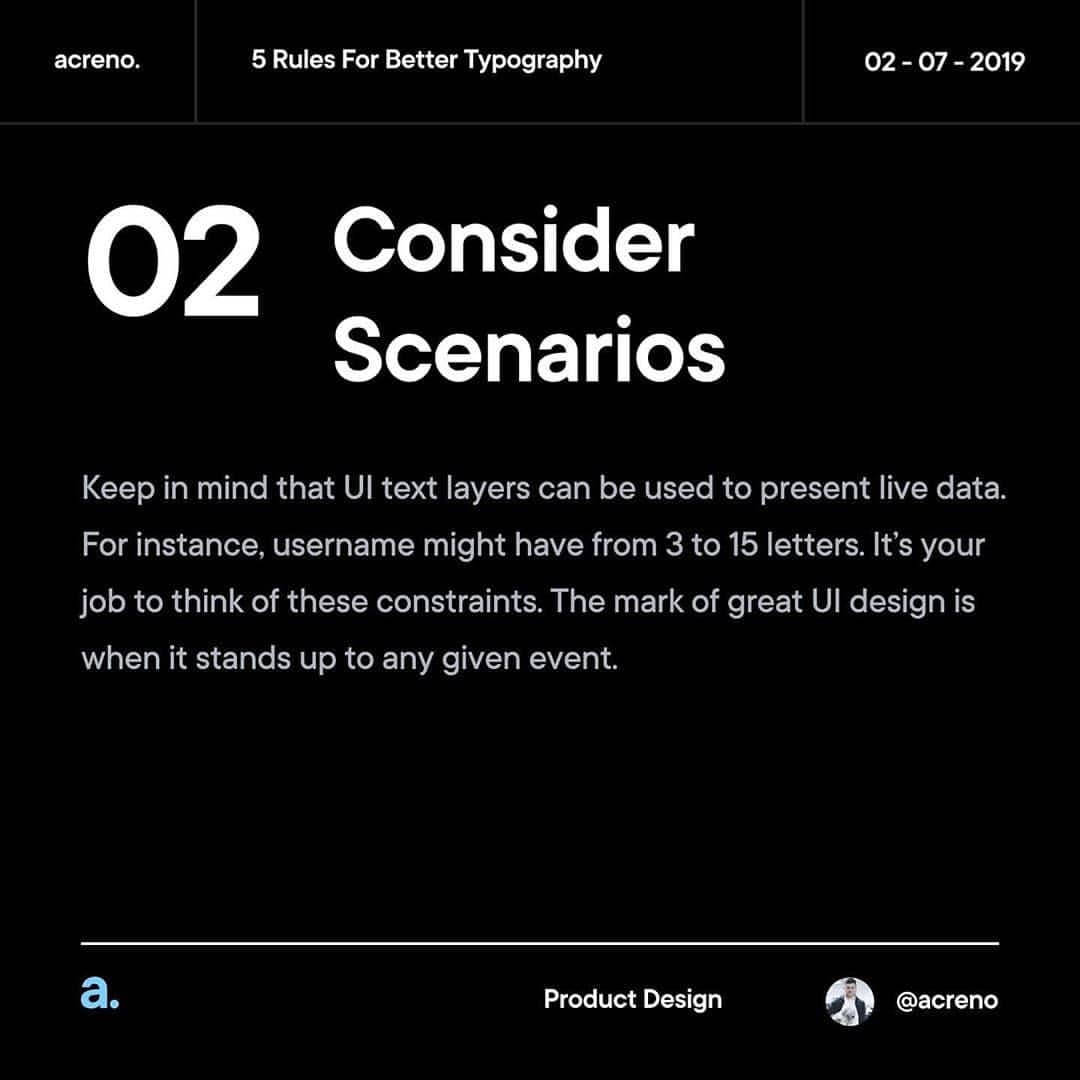
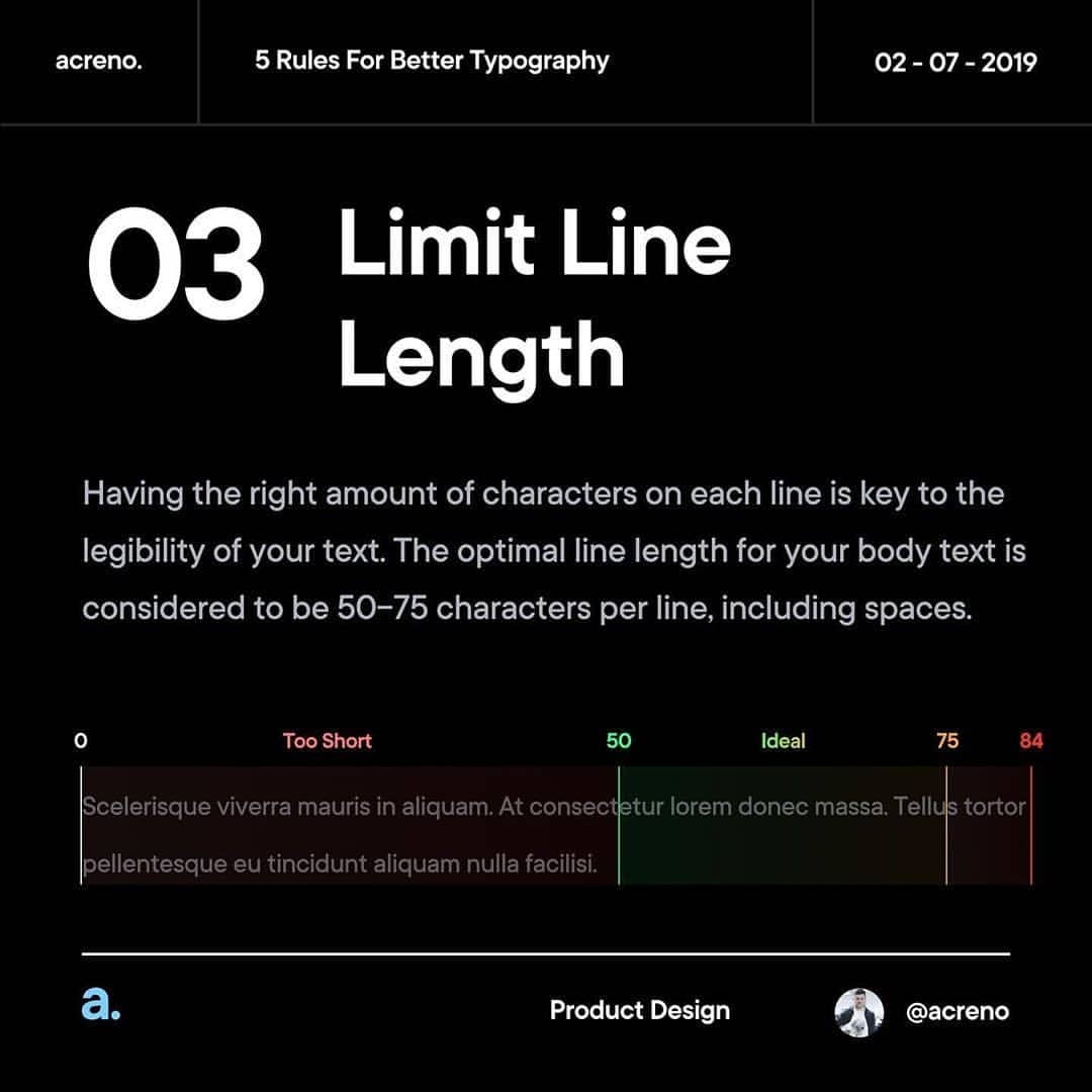
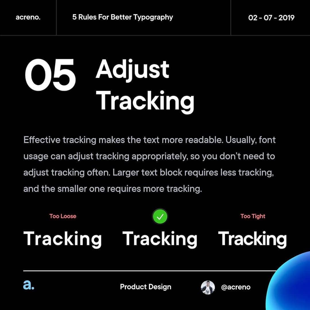
It’s quite challenging to make typography work for your users just right. But there is actually a practical way to follow. This insta post describes essential practices of typography in design.
.
Few Additional Tips
.
1️⃣ Never use Lorem Ipsum
2️⃣ Keep your contrast (size, colour, etc.)
3️⃣ Search for new fonts on behance
4️⃣ Use 4/8px grid
5️⃣ Keep hierarchy
6️⃣ Left side aligment for copy blocks
